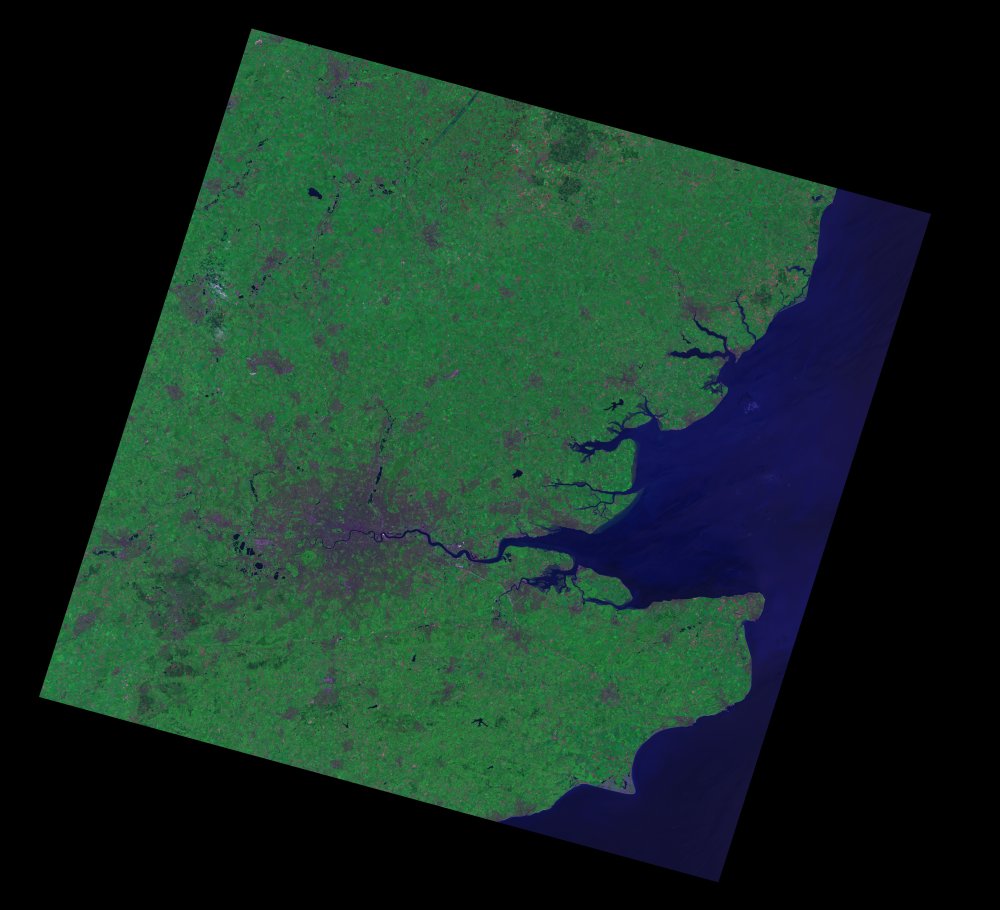
The hypothesis I’m working on at the moment is that there should be more OpenStreetMap data (i.e. more nodes, more ways etc) in urban areas. To find out where these urban areas are I’m using freely available LandSat 7 data downloaded from http://www.landcover.org/data/landsat/. The data comes in the form of 8 different greyscale images corresponding to 8 different spectral bands ranging from visible blue light (0.45-0.52 µm) to thermal IR (10.40-12.5 µm). Using bands 1,2,3 corresponding to blue, green and red a ‘true’ colour image of an area can be built, however this is not the best combination to use to highlight urban areas it turns out that the best combination is 7,4,2 for red, green and blue. Head over to my page on using LandSat imagery in GIMP to find a tutorial on all this.
What I’ve been working on over the past few days is how to use the false colour image I’ve produced using bands 7,4 and 2 to highlight the urban areas.Below is the 742 false colour image, and we can see that urban areas appear quite brown and purple, the aim is to extract that information and make everything else invisible. The problem is that some of the sea to the East is a similar sort of colour to the cities.
I decided the best way to extract the urban areas from the image above would be to decompose the image into hue, saturation and value. The hue is the most interesting component, giving a good contrast between rural and urban areas, but as we can see there is little difference in colour still between some sea areas and some cities which could prove a problem in extracting just urban areas.
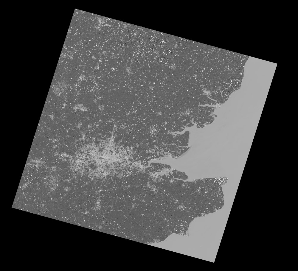
The next step is to apply a colour threshold on this image to try to pick out only urban areas and black out everything else. After a great deal of playing around with filters the urban threshold here appears to be within light levels 196-212, after applying this filter the image below is obtained.

As we can see the urban areas are nicely highlighted in white and everything else is black. Now the aim is to compare the brightness of every pixel in this image with OSM data. We know the coordinates of the image above and we kno that each pixel is (30m x 30m) so this should be easy enough using a simple bounding box query of the OSM database. Lets hope that there is a relationship now between OSM data and the brightness of the pixels above. I’ll be back with any results when I have them and then hopefully be rolling this out across the world.
Click on the image below for a nice flowchart of the whole process.


If you’ve got problems with the sea looking like coastal cities then how about getting an outline of the coast and using that to cut sea out of your image. I know estuaries and rivers may still show up, but it would minimise the error if you had no other option.
I’ve started to help with a crowd-sourced approach to finding out how much is left to be mapped. If we can all map an area then surly we+more can say how mapped it is. My post on this.
Its definitely something to look into. It does make things a little more complicated though and theres already going to be hideous amount of data. But thank you for the idea.
Very interested in your post an idea of flagging up squares as complete, its good to know that someone has taken that project on. Check out OpenStreetBugs for a similar idea but using nodes to tag rather than squares.